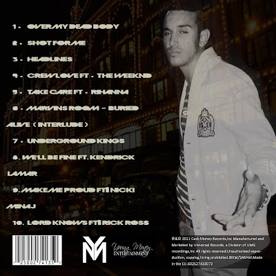
I am extremely pleased with the outcome of our CD Digipak . I believe it has several elements , which cause it to appear both professional and pleasing the the audience's eyes. The front cover works incredibly well since it contains the typical conventions of an album cover. The fact that it's not too simplistic helps contribute to the idea of it being a realistic album cover , rather than a singles cover which is often simple . The overlapped and faded images help create more of a sophisticated look to the album cover , followed by the additional small print writing on the back cover. The typical conventions normally found on a CD cover , can be found on our digipak , which helps create a realistic and professional look to our digipak. This can be found through the use of the 'Parental Advisory logo' the 'barcode logo' the 'young money logo' all these features are typical conventions of existing CD covers that you would find in the high street shops of today. However on the other hand , I feel that our digipak is not too overcomplicated as this would cause it to look rather unproffesional. I've tried to use a Variety of font sizes and styles to break up the text slightly , But have transcripted the main font on the front cover onto the back cover , to write the track list. I've kept the fonts the same , in order to maintain the link between the front cover and back cover.
In relation to our music video , I believe that our ancillary task works exceptionally well , in the sense that it looks extremely professional and correlates strongly to the themes and ideas conveyed throughout our music video. The image inserted above is an annotated image of our front cover back cover . Since I was limited with space , I was unable to analyse the CD digipak in depth.
So I will begin to analyse , How I feel our CD Digipak compliments our music video...
 The most apparent simularity , between the two , is that the same artist is used , who adopts the persona of Drake. The image to the left is a screen shot of our music video , where you can see the artist , who appears in both music video and Ancillary task. I believe that it's essential to have the same artist in both tasks , since the CD cover would simply be irrelavent , if another artist would use. An additional factor which is simular is the effects used on the image ,however , unlike the CD cover sepia is used instead , throughout our music video. As a group we both felt that the use of effects on the images helps create a gloomy overcast feeling , which relates well to the song meanings and connotations.
 Additionally, a relationship , our ancillary task has with our music video , is that both products feature the same background/location which is knightsbridge. We found that Knightsbridge creates a radiant glow to the background which is ironic since it's night time. Also the bright background , with the dazzling lights , contrasts againgst the mood evoked throughout the song , which is rather downbeat and dull. The relationship between the two products is crucial as it creates the link between the video and song , which is the featured song of the album . This almost creates a theme for our album.
I also feel that the magazine advert is also effective
and reflects our music video hugely . I have featured
black and white throughout the poster , creating a
modern and urbanised feel to the poster, however
this contrasts to the sepia used throughout our video.
The same Artist which is used within our music
video , also features in the magazine poster , creating
a relevant link between the two. In addition to this
the city lifestyle inserted in the background of this
poster, is reflective of the city lifestyle that features
throughout our music video. The font used , is also
used on the album cover so therefore links our poster
with our album cover. In effect , I think our magazine
cover is extremely effective in combination with our
actual music room , since it's promotional and advertises
'Marvins Room' on the album.


No comments:
Post a Comment