Friday, 16 December 2011
Evaluation 3 by Jamie Hutton
After getting reciving our audicene feeback me and Yharnna discussed on video (seprate post) about peoples opions and ideas amongst our music video. Overall we discuss that a majority of our feeback was positive however thoughts that we could of changed ourselves. we speak about our strengths and weaknesses of our music video from our view too. We speak about what we thought well about it and how excellent we think it is and what we have achieved from working in a group of 2 the smallest group in our class and how much work and creativity we have put into our music video A level course.
Evaluation 4 By Jamie Hutton
Throughout our construction of our A level Music video course different types of media technology was used into the reasearch and construction of the process of our video. First of All me and Yharnna used the internet as a tool of research into Music videos such as the development of them and how this has progressed over time. We looked into how music videos were published through tvs, used in films and example is Haed days night a film that occured with a vary of music videos of The Beatles this was used as a promotional tool; which is the idea of a music video to promote the song and the artist.
Secondly we looked into conventions of music video what is suspected and what may seem un typical. music videos were seen to have a narrative or be a perfomance of the artist or band. Me and Yharnna decided to follow the typical conventions of a music video as it was more occuring to us along with choosing a narrative then a performance.
We used the internet and mp3 to choose what song we was looking for, and watch the official video to give us an idea but however make it our own
As you can see from Yharnnas evlatuion there is pictures of me that Yharnna took of me filming using a jvc camrea this is one other tool we used to help create the video. After the shooting our music video we then had to use a usb wire to import our music video onto I Movie we decided to use this format as I have had experience in using it before. during editing we used different aspects of what I Movie offered to create our video which I found very useful.
Whilst doing this Yharnna began on the creation of our digi pak as i finished editing Yharnna had examples of what we could do were we both used photoshop to do so. We used the camreas on the computer itself to feedback information we have gathered from our audicence feedback.
Without having the use of technology our course would of been very challening for us. With the use of it we belive it has helped us and we have done extremely well.
Thursday, 15 December 2011
Wednesday, 14 December 2011
Analysis of Drake the Artist-Yharnna Dior Joseph

Evaluation3-Yharnna Dior Joseph
The video inserted above is simply an additional discussion of what we found out from the audience feedback , addressing areas relating to our video such as ,
how professional was our video , in terms of typical conventions ?
How it is suited to its target audience? and what me and Jamie would maybe change if we had an oppertuninty to .
Monday, 12 December 2011
Evaluation 4 - How did you use new media technologies in research and planning construction and evaluation stages?
Throughout the course of our Research and planning, Construction and evaluation stages , as a group we used several media technologies , to help aid us in producing work to the best of our ability's.
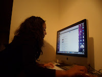
The first media technology that we would have used , would have been the internet on a computer , where we researched the typical conventions of a music video , examples of music videos and information about our inspirational artist, Drake. To the left is an image of me using the internet to research and plan stages of our music video . In particular , the site "www.google.com" was an extremely useful tool for our planning and research.
 The image to the left is a screen shot I took , whilst using the website "www.youtube.com" this is the site of which , we were able to listen to different songs belonging to our artists , and make a decision which song we liked best as a group. Youtube was extremely useful as not only were we able to research video from our desired artist , we were able to watch existing music videos and analyse the conventions of a good music video , which helped tremendously when planning and constructing our own music video.
 Towards the left is an image of my camera, I used to film , several clips of our music video. It's a samsung 14Megapixel camera , although its only a digital camera , me and Jamie were both impressed with the quality of filming from this camera. I also used this camera to photograph the Artist for our ancillary task .
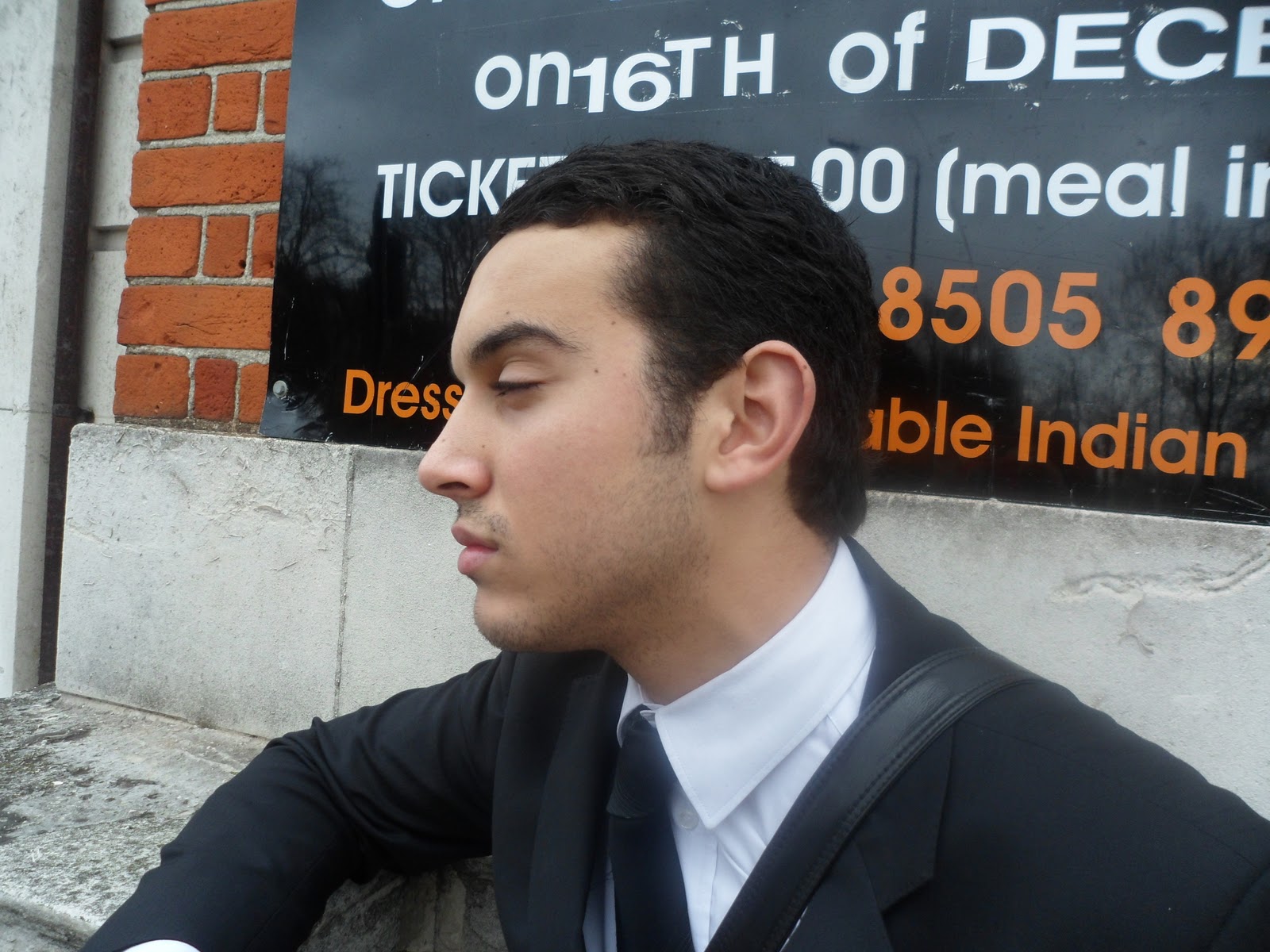
 The image inserted to the left , Is an image I photographed , whilst we was filming at Knightsbridge . In the photograph you are able to see Jamie filming our main artist , using a video camera , that we borrowed from school. The video camera we used was a JVC recorder , in order to film a still and steady shot we had use a tripod , in support.
 This image to the left is a picture of me using Imovie . Imovie was an essential tool thoughout our production process , since we used it to edit our music video until it was complete. When using I movie , we firstly imported the song 'marvins room' where we then imported footage each time we went filming. It was absolutely crucial that we imported footage to Imove immediately , as if the camera's were lost at , we would have lost our footage. Imovie was an amazing tool to use for our editing , in the past we had used Imovie HD however for this project , we both felt that IMovie was more advanced , with better editing tools , to create a higher quality music video.

The first media technology that we would have used , would have been the internet on a computer , where we researched the typical conventions of a music video , examples of music videos and information about our inspirational artist, Drake. To the left is an image of me using the internet to research and plan stages of our music video . In particular , the site "www.google.com" was an extremely useful tool for our planning and research.


Evaluation 2 - How effective is the combination of your main product and ancillary tasks ?

I am extremely pleased with the outcome of our CD Digipak . I believe it has several elements , which cause it to appear both professional and pleasing the the audience's eyes. The front cover works incredibly well since it contains the typical conventions of an album cover. The fact that it's not too simplistic helps contribute to the idea of it being a realistic album cover , rather than a singles cover which is often simple . The overlapped and faded images help create more of a sophisticated look to the album cover , followed by the additional small print writing on the back cover. The typical conventions normally found on a CD cover , can be found on our digipak , which helps create a realistic and professional look to our digipak. This can be found through the use of the 'Parental Advisory logo' the 'barcode logo' the 'young money logo' all these features are typical conventions of existing CD covers that you would find in the high street shops of today. However on the other hand , I feel that our digipak is not too overcomplicated as this would cause it to look rather unproffesional. I've tried to use a Variety of font sizes and styles to break up the text slightly , But have transcripted the main font on the front cover onto the back cover , to write the track list. I've kept the fonts the same , in order to maintain the link between the front cover and back cover.


In relation to our music video , I believe that our ancillary task works exceptionally well , in the sense that it looks extremely professional and correlates strongly to the themes and ideas conveyed throughout our music video. The image inserted above is an annotated image of our front cover back cover . Since I was limited with space , I was unable to analyse the CD digipak in depth.
So I will begin to analyse , How I feel our CD Digipak compliments our music video...
 The most apparent simularity , between the two , is that the same artist is used , who adopts the persona of Drake. The image to the left is a screen shot of our music video , where you can see the artist , who appears in both music video and Ancillary task. I believe that it's essential to have the same artist in both tasks , since the CD cover would simply be irrelavent , if another artist would use. An additional factor which is simular is the effects used on the image ,however , unlike the CD cover sepia is used instead , throughout our music video. As a group we both felt that the use of effects on the images helps create a gloomy overcast feeling , which relates well to the song meanings and connotations.
Additionally, a relationship , our ancillary task has with our music video , is that both products feature the same background/location which is knightsbridge. We found that Knightsbridge creates a radiant glow to the background which is ironic since it's night time. Also the bright background , with the dazzling lights , contrasts againgst the mood evoked throughout the song , which is rather downbeat and dull. The relationship between the two products is crucial as it creates the link between the video and song , which is the featured song of the album . This almost creates a theme for our album.

I also feel that the magazine advert is also effective
and reflects our music video hugely . I have featured
black and white throughout the poster , creating a
modern and urbanised feel to the poster, however
this contrasts to the sepia used throughout our video.
The same Artist which is used within our music
video , also features in the magazine poster , creating
a relevant link between the two. In addition to this
the city lifestyle inserted in the background of this
poster, is reflective of the city lifestyle that features
throughout our music video. The font used , is also
used on the album cover so therefore links our poster
with our album cover. In effect , I think our magazine
cover is extremely effective in combination with our
actual music room , since it's promotional and advertises
'Marvins Room' on the album.

Ancillary task- Design and devlopment
After designing our second cover which was to be inserted within the second slot of our album casing , me and Jamie were both extremely impressed and were indecisive of whether or not this cover was in fact better than our original front cover . when in class I approached my teacher , who agreed that they were both extremely good designs , but the Second design , contained more elements , causing it to appear more appealing . I also asked our media technition who gave fantastic and truely benificial advise. What she had said was that our first design was more simplistic and was more suitable for a front cover of a single rather than a album. Where as our second deisgn was more complex and was suited better for an album cover rather than an insert.


The two images to the left are the two images which we were deciding upon , for our front cover . I had only inserted the
'parental Advisory' logo on the left image to help compare which looked better as a front cover. After careful analysing , and taking in the advise we had recieved . Me and Jamie had decided to choose the image on the left , as we felt it was more appropirate. Because the second image was also very effective and professional looking , we thought it would b best if we swapped the two around , and used the second image as a slot instead.
Ancillary task- Second cover (slot in)
For our second cover which was to be a slot insert , situated in the inside of the CD cover , I decided to go with a lighter background rather than black. Like the backcover , I decided that I wanted to choose a long shot of our artist rather than a close up . Below is an image of the Second slide .


This image designed shows contrast to our previous album cover
in the sense that lighter colours are used , Different images are also used
and there is a differennce in the fonts used. I believe this design works really well , and appears extremely professional to the human eye , I have combined the two images of a city life and a piano together to create a musical feel to a city lifestyle . The contrast together works extremely well together
and conveys the idea of an album .
ancillary task- Final Back cover

I felt it was nessesary to insert the 'Young money' Logo towards the bottom , which is the record label who signed 'Drake' . Additionally I found that existing album back covers contained plenty small print writing.
So I researched what this writing consisted of , and found that it was mainly information related to copyright . I then inserted small print writing in the same way of which I had seen it on other album covers. I believe that this improved our design immensely , as it added the complete finnishing touch which we'd hoped for.
Ancillary task- Final Back cover Design development
After designing what I thought was going to be the final version of our back cover , I decided that it lacked several elements , which prevented it from looking completely professional , which me and Jamie had originally hoped for. This therefore lead me into researching Album backcovers in more depth.


The image above is a screen shot of the search results , listed when searching 'Album backcovers' Once looking at each and every image found in the search , it becomes clear that each and every album cover , possesses more writing , that our CD back cover had . This therefore meant that I needed to add more contextual information to my CD Digipak , in order to add a professional feel and look to our Digipak .
Ancillary task- Designing the back cover-Yharnna Dior Joseph
For the back cover , we wanted a long shot of the model rather than a face shot , to show some variety in terms of camera angles on the CD Digipak. However the images taken in the photoshoot were all close up images of a face , rather than long shoots . This therefore meant that we had to arrange with the actor/model to take more shots of him , preferably in a different outfit , to avoid a repetition of outfits.
After taking several shots the images that we felt worked best were ...


After taking several shots the images that we felt worked best were ...


we found that both of these images worked well , they portrayed the image that model has power and authority which we thought related to the fact that it's his album back cover. However a decision was made that the first image is more effective , as it's almost as if the model is trying to convey a personal message the audience .
To avoid a backcover which is simply too simplistic , we thought that it would be nessecary to insert an image in the background of the backcover . After careful thought , I decided that an image of knightsbrige would work well in the background , as it's featured throughtout the video largely . The repetition of the Knightbridge almost sets a theme for the album , since it's inspired by the idea of a lonely man surrounded in a big , flashy bright city .

The image on the left is a photograph of
Knightbridge at knight time . The lights
on harrods convey the exact idea that we
want . Also the fact that the shape of the
huge building is highlighted , will work well
as the background image of the back cover
of our CD digipak.
The image below is the first draft of our Back cover for our digipak.

For the back cover , we decided to use a black background as we
felt that it would compliment the knightsbridge background
, emphasising the idea , that it is set at nightime . we lowered
the opacity of the background so that it did not take too much
attention , since we wanted it to appear extremely subtle , and
for the artist/model to be most noticable in the image. we adjusted
the brightness and contrast of the artist , so that that he stood
out from the page even more so . we also faded him slighltly
to evoke that murkyand dismal feeling. we believe that that font
works well , and the Barcode scanner helps the back cover to look
professional.
Ancillary task- Designing the Front cover

fairly simplistic as me and jamie had originally decided however i felt that , the image used didnt work well with the rest of the cover , I lied the image itself but was unkeen on the brightness used . Since the
font remained a gradient shade of grey , and the background was black , the image was simply too bright
and colourful for the CD cover .

transforming our image into black and white , and adjusting the contrast so that the model stood our more . I'm extremely appreciative of the way in which his dark features are emphasised by the contrasting and brightness adjustments . I think this helps create the gloomy mood , that me and jamie were in search for.
Moreover , although we wanted a simple look , I found that the previous draft was too simplistic , so therefore inserted a microphone into the image , where I then edited the opacity on the image until it faded out enough. Research also showed that all albums consisting of profanity and foul language , will have the 'Parental Advisory' logo inserted on the front to indicate this. I though this sign made our cover look extremely realistic and professional. The contrasting fonts and font sizes works well , as it breaks up the font , causing each font to stand out more. As a group me and Jamie were both content with this design generated and felt that it worked well as a CD front cover.
ancillary task- Designing and developing ideas 2-Yharnna Dior Joseph
For our first pannel of our CD cover , which would be our front cover we had decided to go with a black background , which would be contrasted with bright imagery and light typography .
After close analysis and evaluating the photography taken for Cd cover , we selected the image that we felt would best suit our CD Cover .
 We chose this image mainly because we felt it worked extremely well with the mood and feelings that we were trying to express to the audience. I'm appreciative of the way of which the model appears to be focused in deep thought. Which creates the idea that he's reflecting or reminiscing on a memory of the past. we believe his facial structure here is bold and sharp demonstrating the 'brave act'
that our artist is supposed to put on.
Another element which is extremely essential to the front cover of our Digipak is the typography
which is used . To create an effective Front cover , we need a font which is going to stand up
from the page , and allur the eyes of the audience.
 In order to ensure we had the best possible
design for CD front cover , we experimented
with a number of effective fonts , saved to
my fontbook on my imac. The words that
would feature on our CD front cover were
simply "DRAKE" "MARVINS ROOM"
we felt that minimal font would help the
front cover remain simple , as we had already
specified. We also felt that all capitals was
more effective. So therefore I Opened up a
black canvas on photoshop and Typed
"Drake in all four fonts" to see which font worked best. Originally I loved every font which had been used , but i had to make a tough decision to what font worked best. After careful thought and consideration , I decided to use the first font , As i felt that the eroded look , reflected the conext of the
album songs and album.
After close analysis and evaluating the photography taken for Cd cover , we selected the image that we felt would best suit our CD Cover .

that our artist is supposed to put on.
Another element which is extremely essential to the front cover of our Digipak is the typography
which is used . To create an effective Front cover , we need a font which is going to stand up
from the page , and allur the eyes of the audience.

design for CD front cover , we experimented
with a number of effective fonts , saved to
my fontbook on my imac. The words that
would feature on our CD front cover were
simply "DRAKE" "MARVINS ROOM"
we felt that minimal font would help the
front cover remain simple , as we had already
specified. We also felt that all capitals was
more effective. So therefore I Opened up a
black canvas on photoshop and Typed
"Drake in all four fonts" to see which font worked best. Originally I loved every font which had been used , but i had to make a tough decision to what font worked best. After careful thought and consideration , I decided to use the first font , As i felt that the eroded look , reflected the conext of the
album songs and album.
Ancillary task- Designing and developing ideas 2
When designing our CD Digipak , I found that it was hard to transcript ideas that we'd had on paper onto photoshop , in the sense that when I had arranged images in the way of which we had originally anticipated on paper , I found that it didn't work as well digitally . This therefore meant that I relied wholly on my artistic imagination , to create designs that we both felt worked well on computer.
The first challenging decision which I encountered , was deciding whether or not I wanted the background to be black or white , I felt that the two contrasting colours evoke different moods . For instance , white is extremely pure , and conveys a mood of serenity and reflection . However on the other hand a Black background is extremely heavy and expresses deep feelings of gloom and desolution if used effectively.
Jamie had suggested to keep the background fairly simplistic , as if it was overcrowed , it may look unprofessional which was exactly what we didn't want.
We had also come to a mutal decision that we were to use a face as the main , focus of the CD cover .
Developing our ancilary task
In order to design our CD Digipak , I used photoshop as we both felt that photoshop was able to give a professional look to our CD digipak , depending on whether or not we used it correctly .
 The image to the left is a picture
of me designing the CD cover ,
using ideas that me and jamie
suggested would work . I
thoroughly enjoy using photoshop
to convey my artistic imagination
through digital media.

Me and Jamie both found that
Photoshop was considerably
challenging , But I eventually
found the experience rather
intriguing and was fascinated by
all the complex tools photoshop
holds.
Developing Ancilary task-Photoshoot.
My brief for this photoshoot , was to Photograph the artist in a style that captures emotions of misery and lonliness ,so it apears as though the artist is reflecting over the past events , which take place in our music video.
 The image to the left successfully
conveys emotions of reflection and
gloom , the model , does not appear
happy . However the brightness
of the image does not help convey
this mood , it would have to be
edited to a darker shade in
order to exert this mood.
 This image is also a possible
image we could use for our
Cd cover, it's not as sharp as
the first image but does
however appear depressed.
but again we would have to
edit the brightness.
 This Picture was taken
at the wrong time , at
the time the mdel was talking
so this image therefore
cannot be used .
 This image is very effective,
I particularly like the fact that
the model looks like he's in
deep thought elsewhere ,
and looks extremely focused.
 The model also appears
focused here , I like the
definition in his jaw ,
it shares vast simularities
with the image situated
above. However I feel
that the angle of the
image above is more effective.
 This image would work
well at the front of our
CD cover , it's simular
to the rest , however
the angle bears more to
the left . On the negative
side I feel as though his
head is not in proportion
with his body.
 The model in this picture
appears dased , and is not
ready for this picture.
Therefore this image will
not be used for our digipak.
 There is a smerk in the
models face within this
photo , this immeditely
illiminates the 'serious'
mood which we tried
to evoke , within our
video.
 This image is not
going to be used
as the models eyes
is closed , and looks
as though he is
half asleep.


conveys emotions of reflection and
gloom , the model , does not appear
happy . However the brightness
of the image does not help convey
this mood , it would have to be
edited to a darker shade in
order to exert this mood.

image we could use for our
Cd cover, it's not as sharp as
the first image but does
however appear depressed.
but again we would have to
edit the brightness.

at the wrong time , at
the time the mdel was talking
so this image therefore
cannot be used .

I particularly like the fact that
the model looks like he's in
deep thought elsewhere ,
and looks extremely focused.

focused here , I like the
definition in his jaw ,
it shares vast simularities
with the image situated
above. However I feel
that the angle of the
image above is more effective.

well at the front of our
CD cover , it's simular
to the rest , however
the angle bears more to
the left . On the negative
side I feel as though his
head is not in proportion
with his body.

appears dased , and is not
ready for this picture.
Therefore this image will
not be used for our digipak.

models face within this
photo , this immeditely
illiminates the 'serious'
mood which we tried
to evoke , within our
video.
going to be used
as the models eyes
is closed , and looks
as though he is
half asleep.

Developing Ancilary task-
After researching existing album covers and digipaks , It became apparent that I would need a clear image of my artist to appear on the front cover of the CD Cover . In order to correlate with the theme of the video , which is that our artist is slightly gloomy at the fact that he is alone , I thought that it would be best take a picture of the artist that captures emotions of depression and lonliness. I though these emotions would be best expressed if the artist did not hold direct eye contact with the camera almost as if he's looking away, from the camera .
In order to capture these images , I decided it would be best if I photographed the artist using a digital camera , instead of using screen shots from the footage of our music video from Imovie. The main reasons for this is because the Imovie image resolution is poor , resulting in poor image quality and defused megapixels.
At this stage , I now had to organise a date with the artist , to photograph him , in the style that we decided would work best.
Ancillary task
For our ancillary task our task was to design a digipack for our music video , which included a CD Cover for our 'album', a back cover , an inside panell , a back pannel and two side pannels .
Originally we had decided to create a digipack consisting of 6 pannels , however when designing I thought it would be easier to create 4 pannels rather than 6.
Researching exisiting Digipacks ...
 The image to the left is an example of an existing digipak. As displayed , it is visible to see that there are four pannles , one being the front cover , the second being the back cover . The third being the pannel which lays behind where the actual CD lays , The fourth being an insert and the last two side pannels which are not displayed , are inserted in the two narrow sides of the cd cover.
What becomes increasingly noticable throughout this digipak is the repetition of the artist's face within every pannel of the Digipak. The images correlate strongly with the theme of the album, which works effectively .
Researching existing Album covers ...
Since we've chosen to make a music video to marvins Room which is by the artist drake i felt that it would be most relevent if I researched CD Album covers by Drake himself , since it would be both inspirational and motivational for our CD Digipak.
 When researching Album covers by 'Drake' I found it extremely hard to distinguish the real album covers to the counterfits , which had been created by people on the web , there were several copies of Drakes album 'Take care' and thank me later , however several of these copies , were designed to a high standard , so could also be used to inspire our Digitpak . What attracted me the most in these CD Covers was the use of Typography , which enabled the cd cover to stand out from the page .
Official Drake CD Albums...
 The image to the left is The CD cover
of Drakes first album called "comeback
Season" . To be completely honestly
I'm not extremely fond of this image
as i find that it lacks sophistication
and is rather simplistic . However
the imagery used within this album
cover is reflective of the message being
evoked. It's almost as if the autum
background of the colourful leaves conveying
themes of tranquility and reflection , which is
essentially what drake has being doing before
his comback.
Originally we had decided to create a digipack consisting of 6 pannels , however when designing I thought it would be easier to create 4 pannels rather than 6.
Researching exisiting Digipacks ...

What becomes increasingly noticable throughout this digipak is the repetition of the artist's face within every pannel of the Digipak. The images correlate strongly with the theme of the album, which works effectively .
Researching existing Album covers ...
Since we've chosen to make a music video to marvins Room which is by the artist drake i felt that it would be most relevent if I researched CD Album covers by Drake himself , since it would be both inspirational and motivational for our CD Digipak.

Official Drake CD Albums...

of Drakes first album called "comeback
Season" . To be completely honestly
I'm not extremely fond of this image
as i find that it lacks sophistication
and is rather simplistic . However
the imagery used within this album
cover is reflective of the message being
evoked. It's almost as if the autum
background of the colourful leaves conveying
themes of tranquility and reflection , which is
essentially what drake has being doing before
his comback.
Monday, 5 December 2011
Evaluation activity 1
In what ways does your media products use, develop or challenge forms and and conventions of real media products ?
Often typical conventions of a music video's consist of ; lip synching , a variety of settings and scenes , enthusiastic characters , props , fast paste and effective editing .
I am extremely confident in saying that our music video supports these typical conventions , since we have range of scenes , where the main character lip synchs , with immense enthusiasm , expressing his frustration , that he is unable to obtain the girl of his dreams. The significant amount of effort the character puts in , when Lip synching , conveys the idea that he is passionate about what he's saying , causing our video to appear even more realistic . The character has also exaggerated his facial expressions , when lips synching to place enthisis on the lyrics of the song making it clearer for the audience.
an additional feature of our music video , that supports conventions of our music video , is the variety of settings and scenes used throughout our video . Most likely a typical music video will consist of 3/5 scenes . However within our music video we used five scenes , which were.
Picture 1 - Yharnna's front room
Picture 2- Park scene
Picture 3- Eamonn's front room
Picture 4 - Eamonn in the mirror
Picture 5 Knightsbridge.
I also feel that the costume used throughout our music video worked well , the first scene where our female character is wearing pjama shorts and a vest top creates the idea that she is casually relaxing in the comfort of her own home . Moving on from this when she is in the park walking with our main character , she is dressed in winter casual wear , where she appears comfy and snuggled , which conveys the correct feel to the video, that the characters were both comfortable with each other , since our male character is also dressed in casual winter wear.
Evaultion 1 By Jamie Hutton
In what way does your media product use, develop or challenge forms and conventions of real media products?


Our music video consist of a wide use of cinematography that follow the conventions of a typical music video, as we use shots like above (establishing shot) this emphasizes the location, enrolling the mood of the song, relates to the lyrics, and the artist.

Within this shot (above) the character playing the Artist of the song Drake is lip synching which supports a typical convention of a music video, in addition to this he shows tremendous enthusiasm playing a strong roll as he expresses the mood of which we had intended to show to the audience. which is a distressed man, this can be shown through the clothing as he is wearing a vest reflecting on his frustration, mood described through the lyrics too. The high angle used illustrates the atmosphere.

The panning shot above again establishes the setting however can show the pace of the song, which reflects upon the mood of the song, as we slowed this clip down, the use of sepia shows the characters feelings and vibe of the song. the use of lighting is very dim, the mood of the song plays a big effect on ours as we show this very strongly through the character setting lighting and use of editing.

the use of medium shots, were our strongest to do when we had lip synching shots as it shows the artist expressions, the background behind the artist can reflect on lyrics as he talks about memories, were we see in other clips him in the past with the girl. with the editing it was quite a light image to begin with, were we had to darken it to comprehend with the mood of the song.
Friday, 2 December 2011
Monday 28th Novemeber
Me and Jamie were extremely satisfied with our finnished music video , in fact we were estatic with the quality of what we had produced, and both thought we worked really hard to achieve this. On monday our task was to generate audience feedback from the rest of our class , on what they thought of our music video, what weaknesses our video had , and how our video followed the typical conventions of a music video.
Jamie was selected to film and interview fellow classmates , whilst I was selected to be interviewed by classmates for their own video feedback. After we had generated enough footage of the interviews , me and Jamie uploaded the footage into imovie and edited it into a video , with transitions and title pages before uploading it onto youtube.
Jamie was selected to film and interview fellow classmates , whilst I was selected to be interviewed by classmates for their own video feedback. After we had generated enough footage of the interviews , me and Jamie uploaded the footage into imovie and edited it into a video , with transitions and title pages before uploading it onto youtube.
28th November 2011 audience feedback
Throughout fridays lesson me and yharnna was finishing of editing our music video, by the end i completed our final music video. This was very promising as i felt very positive and confident about our music video as it worked very well and was as me and Yharnna thought it would be.
After everyone completed there music video we all watched and analysed each others, then fed back the strengths, weaknesses, and if any typical conventions were noticed. I interviewed 4 groups of people, and asked them three questions each for them to answer back in detail, overall we gained at least 90% positive feedback and were told a few things we could of changed such as that we had to many fades that could of been cut down, and lip syncing was out just a slight part out the end.
Me and Yharnna stayed in our extra time to edit and put together the interview and feedback on our music video so it can be ready to upload onto the blog.
Monday, 21 November 2011
21st November 2011 Jamie Hutton
Today is our final day to complete every part of our filming we are doing our last scene breakdown, which is the main sequence towards our narrative. We will be heading down to knightsbridge just before it gets dark to reflect the mood/atmosphere we are looking for. We have been preparing our day as we spoke about the types of different mise en scene such as the lighting in Knightsbridge and the clothing on our main artist etc. We have spoken bout the use of cinematography, we have thought of some really effective shots to use, we will get in a cab with our camera getting the view of knightsbridge night life showing how its all lit up by our panning shot or dolly shot. Me and Yharnna our most certain were we will be planing our shots within the whole finale of the music video.
Friday, 18 November 2011
Drake Take Care

Year 13 Media Coursework - Ansillary task
For our Ansillary task , as a class we were all given the same brief which was ; Create and authentic example of the digipak and magazine advert. In order to complete this coursework , crucial research was required , which was the following :
- To find several examples of a promotion package for a release of an album
- To find an example of a Digipak( CD/DVD package)
- Analyze the examples and identify the conventions of the media form .
- Make a list of conventions .
- Draft your work on your work on paper and photograph or scan it for your blog.
- Decide on what images and format what you're going to use . Give reasons on your blog.
- Create the final product on your computer .
- The entire process should be discussed in detail on your blog .
Monday, 14 November 2011
CD Digipak By Jamie Hutton
We are going to be making a cd digipak as part of the promotion package for the release of the album. Before we can eve start we are going to need to know which type of digipak we want and the dimensions of it.
CONVENTIONS of a CD digipak:
- artist/band name
- song/album name
- tracklist
- visual images that relate to the song/album
- booklet containing information on the songs and the lyrics
- record label name and logo
Conventions of a magazine advertisement by Jamie Hutton
- visual image connected to artist/song
- band or artist name - this allows the audience to easily identify the band or artist
- date of release of album
- record company name or logo
The magazine advert must relate to the song, making it distinctive and easily recognizable for the target audience to see.
Magazine Advertisement By Jamie Hutton
Due to technical issues with the computers we could no longer carry on with the process of editing our music videos. For the time being we are starting our ancillary task, making our magazine advert and cd digi pack. However again because of the issues we our having with our computers I could not save the templates to upload them, in this case I started producing the advert on photoshop.
For research we had to google other magazine articles...


For research we had to google other magazine articles...
This is a magazine advertisement for one of Tinie Tempahs albums, showing the artist himself taking up most of the advertisement with a dark narrow background showing outer-space linking with the title of the album cover, i chose this as an example as it is similar to something i would like to work around to have a similarity as my magazine advertisement.
This gave us many ideas on the style and layout of our article and what things we have to put on our article. For example we needed to put on the logo of the record company something this one does not include.
I think that this sort of theme would work quite well as it would portray the feelings and emotions of the characters in the video and the theme of the song aswell as our song "Drake- Marvins Room" would have a similar act as this album advertisement.

This album advertisement is rather plain but illustrates a lot of power as the artist is the image on the advertisement making him recognizable, and the use of red colour agian shows power, this again is something similar to what we would like mainly showing the artist and the mood.
Subscribe to:
Posts (Atom)